LOS ANGELES
,
April 1, 2022
(Industry Intelligence Inc.)
–
CBD beverage brand differentiates itself with triangular cans Nebula 10 is a Berlin-based CBD beverage brand targeted at consumers with an appreciation for alternative culture. To align with that notion, the brand cleverly opted for triangular metal cans rather than circular ones. Additional design elements include a vibrant red hue and psychedelic-inspired typography, which play into the product’s value proposition of “enabling consumers to take the edge off in a healthy way without the repercussions of other harmful substances or habits,” explains designer Carla Young. Overall, the look of Nebula 10 “boasts confidence through the supporting art direction and is designed to act as a mirror to pave a way for a new alternative niche in the overcrowded CBD marketplace,” she adds. The primary source of this information is The Dieline Liberté is a brand with a bold name whose naturally fermented drinks are meant to challenge traditional soda, serving as a healthy alternative. Accordingly, its packaging design—a glass bottle with a label on the neck that resembles a waving flag—acts as a declaration that you don't have to give up flavor to be healthy. The labels work like protest banners, showcasing the phrase “Stay pure!” on the Chamomile-Lemon flavor and "Stay true!" on the Blue Oolong Tea flavor. Created for a chain of restaurants called Bushe, the labels play up the protest movement “brazenly, but not intrusively,” says Suprematika, the Russia-based design firm that created the look. The primary sources of this information are The Dieline and Suprematika The art of cheese slicing becomes much simpler and cleaner thanks to a simple and artful packaging design by Federica Marziale Iadevaia, an Italy-based designer. Created for Capraestum, a goat cheese farm in Greece, the packaging consists of a paper wrap and a paper label featuring an organizational grid for cutting. The round shape of the label supports the round shape of the cheese block to ensure clean fractions. To complete the look, the labels are typeset in Neue World and Gatwick, both designed by Pangram Pangram Foundry. The primary source of this information is The Dieline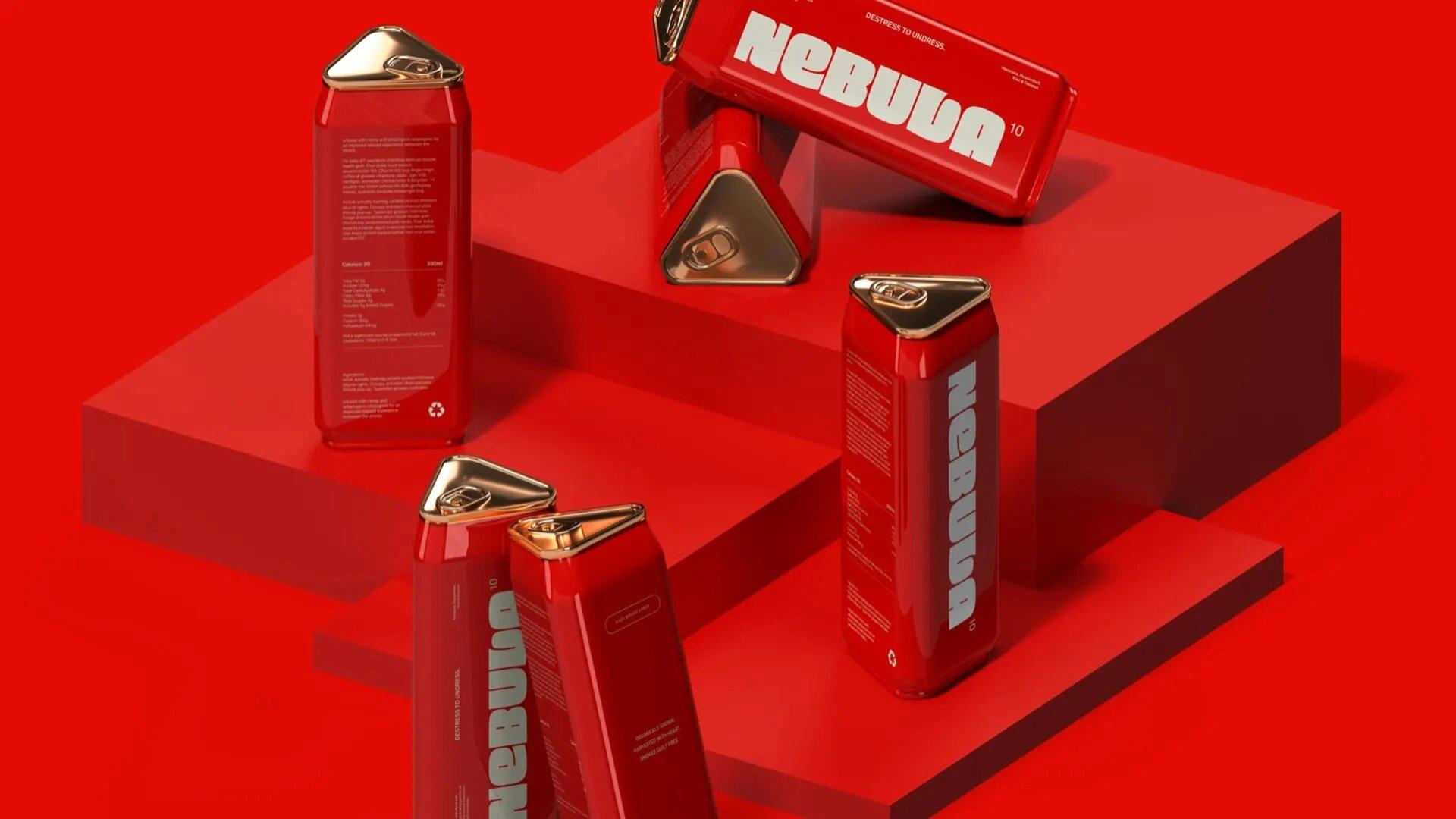
Flag-inspired labels evoke protest movements for Liberté drinks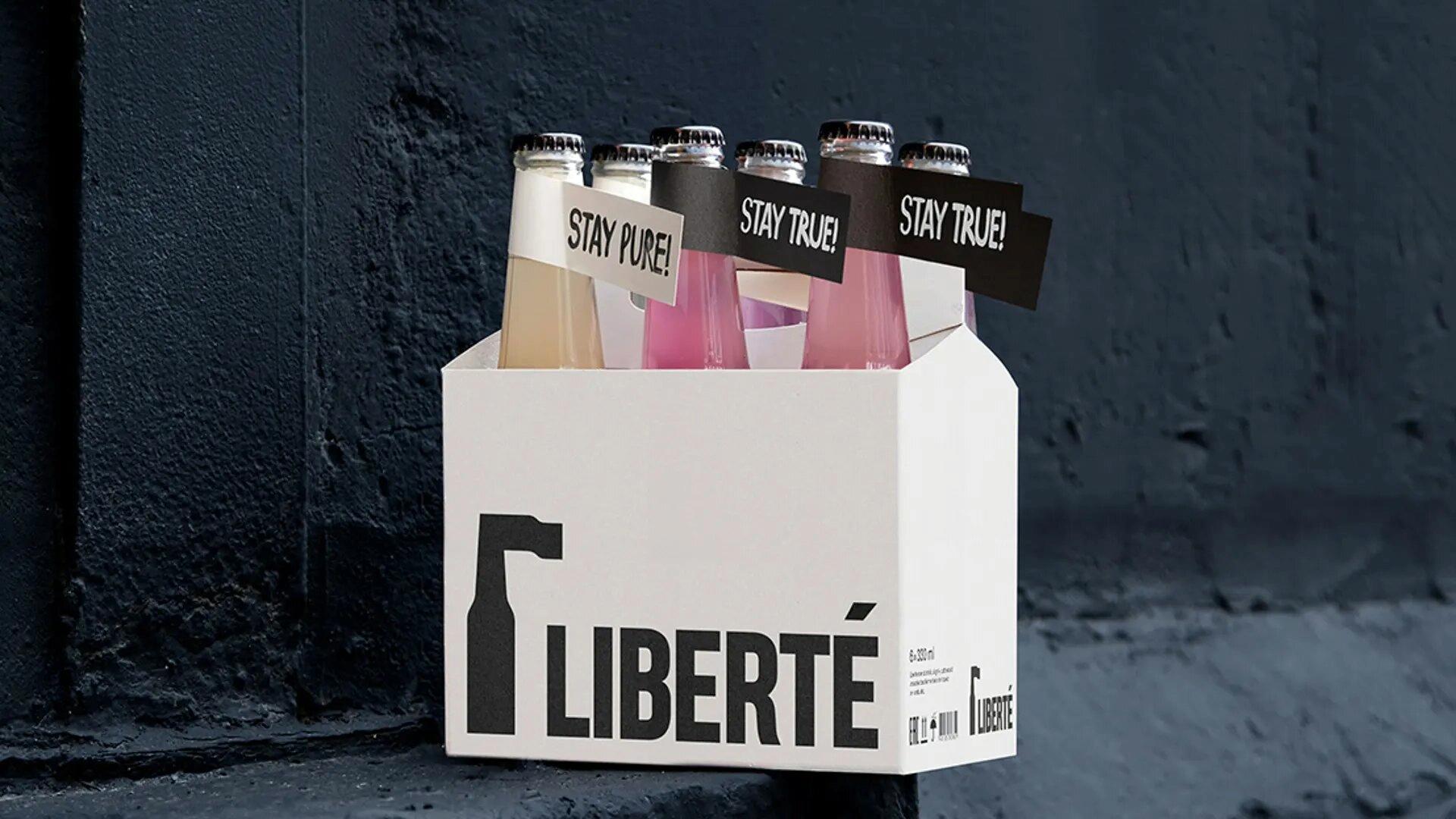
Grid-like packaging system for goat cheese facilitates fractioning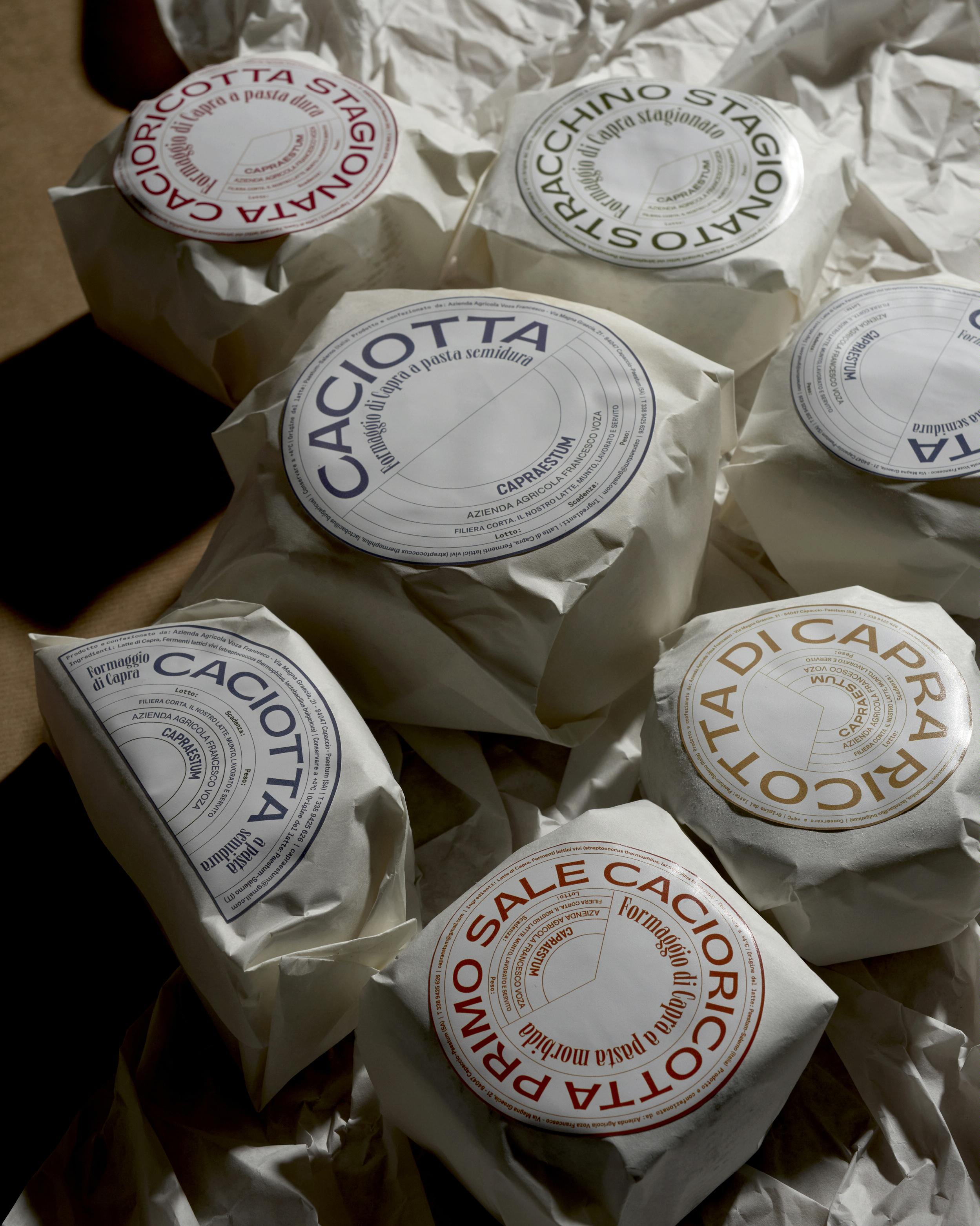
* All content is copyrighted by Industry Intelligence, or the original respective author or source. You may not recirculate, redistrubte or publish the analysis and presentation included in the service without Industry Intelligence's prior written consent. Please review our terms of use.


