LOS ANGELES , July 22, 2022 (Industry Intelligence Inc.) –
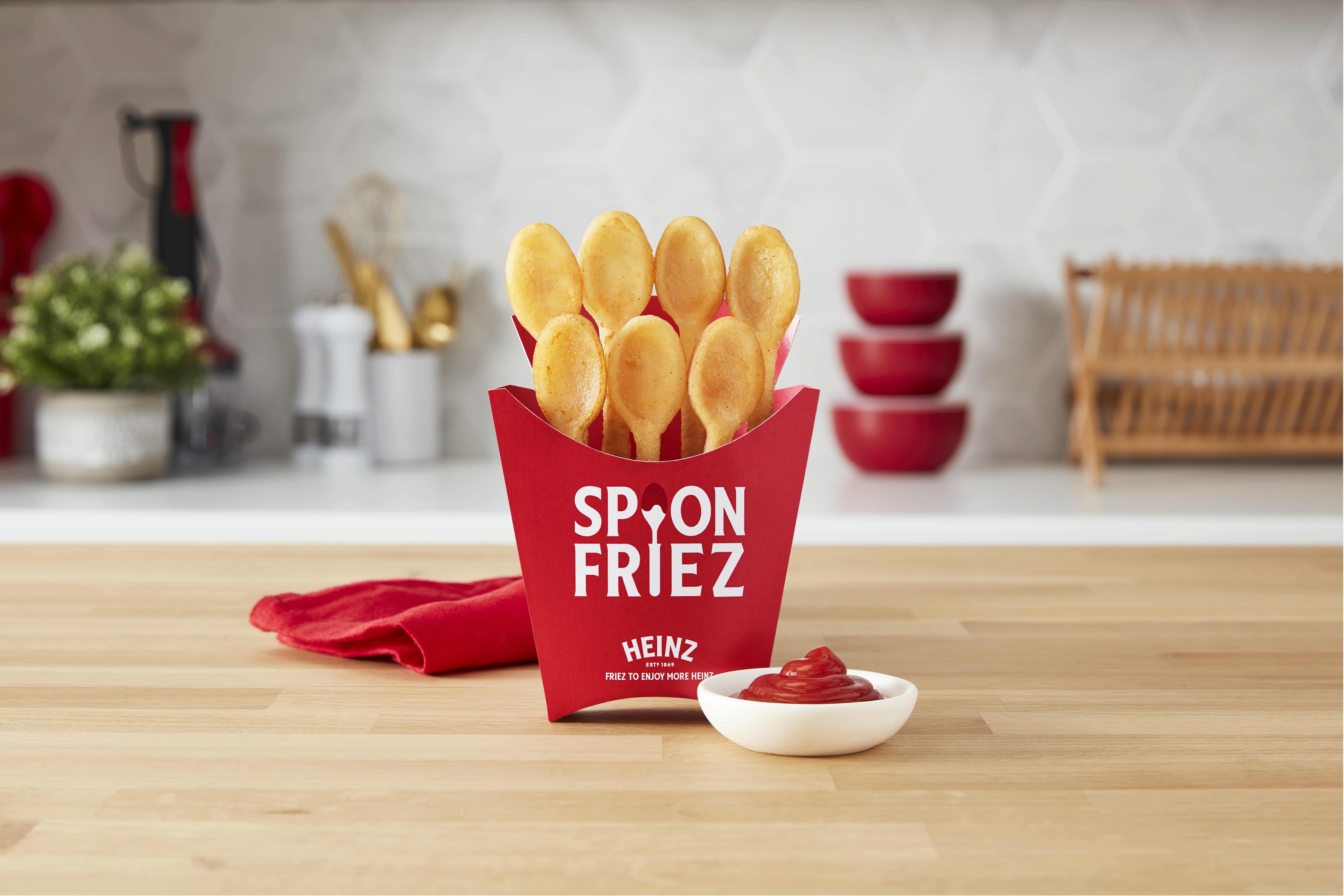
Heinz creates edible spoons for ketchup

Heinz UK understands that French fries are only as good as the dipping sauce that accompanies them. To that end, the company recently launched Spoon Friez—edible spoons made of French fries—to help consumers grab the perfect dollop of ketchup in one clean swoop. Launched in limited quantities as part of a sweepstakes, the innovation aimed to make the eating experience more enjoyable, as Heinz research shows 84% of sauce superfans are often left feeling frustrated by failing to achieve a decent dollop of sauce on a single fry. While the edible utensils primarily served to promote Heinz condiments, the concept could have implications for the foodservice sector as a value-added product that reduces packaging waste.
The primary sources of this information are Lad Bible and Heinz UK
Designer upcycles fishing containers into furniture

Containers used for transporting fish are a common waste material in the logistics sector but are also an unlikely source of recycled material for a line of sustainable furniture. The Common Neglect Material collection by Japanese designer Takuto Ohta features bright yellow plastic chairs with an aesthetic that highlights its material origins rather than hides it. The collection includes a lounge chair, armchair and stool, and is achieved by cutting, melting, bending and bolting the containers into the necessary position to achieve the seat-like design. The chairs are durable enough to withstand regular use in outdoor areas and can also be used in industrial settings where seating is required.
The primary sources of this information are Trend Hunter and Yanko Design
Squeeze tube takes on nature-inspired appearance throughout its use

Even the most well-designed flexible tubes can take on a different and arguably less attractive appearance the more they’re squeezed and emptied. Designer Han Gao decided to embrace that natural transformation, creating a squeeze tube for Démi Bai hand cream that gradually resembles the abrasive yet beautiful look of volcanic rock or molten metal. To create the look, Gao opted for a color palette of cold greys and grainy metallics. As the tube gets squeezed more and more, it takes on a jagged and rough structure, similar Earth’s natural elements. The tube also includes small, minimal typographic touches—tiny text shifted to the right—showing only key information about each product. “By slightly shifting all text on the right a little, an error – a touch of handmade – was intentionally put into the design language,” Gao told It’s Nice That. Meanwhile, the font sits between serif and mono-spaced type to create a feeling of distance. Overall, thanks to Gao’s peaceful, pared-back approach, the tube takes on an experimental yet calm and sophisticated look.
The primary source of this information is It’s Nice That
* All content is copyrighted by Industry Intelligence, or the original respective author or source. You may not recirculate, redistribute or publish the analysis and presentation included in the service without Industry Intelligence's prior written consent. Please review our terms of use.